Kleenex Ad T-Shirt: Design Description
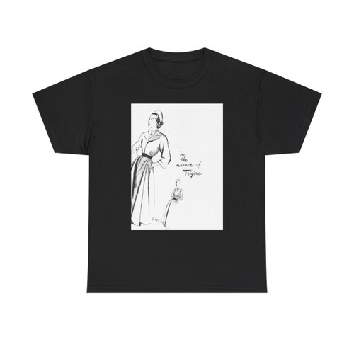
This t-shirt design recreates the iconic visual language of a vintage Kleenex advertisement, a nostalgic homage to a brand deeply embedded in American culture. The central artwork evokes a sense of tenderness and care, core themes frequently explored in Kleenex advertising throughout the mid-20th century.
Artwork and Visual Elements
The primary design element is a stylized illustration, reminiscent of the artwork often found in magazine advertisements from the 1950s and 60s. Soft, pastel colors dominate the palette, creating a feeling of warmth and gentleness. The artwork features two figures, likely a mother and child, engaged in a caring gesture, perhaps a mother offering a tissue to a child.
The typography is another key component. A classic, elegant font style is employed for the word "Kleenex," mirroring the typography used in original advertisements. The word "Kleenex" is prominently displayed, acting as the brand identifier. The design is complemented by decorative elements, such as elegant flourishes or subtle borders, which further contribute to the vintage aesthetic.
Meaning and Symbolism
The design, rooted in themes of caring gestures and sentimental moments, embodies the emotional connection historically promoted by Kleenex. The imagery of a mother and child evokes feelings of comfort, security, and the enduring bonds of family. The choice of colors and artistic style reinforces these themes, presenting a visual narrative of tenderness and emotional support, synonymous with the Kleenex brand.
The t-shirt design thus transforms a classic advertisement into wearable art, acting as a visual celebration of a brand known for its comforting presence in everyday life, and a reminder of the historical trends that continue to influence how we see products and the emotions they represent.