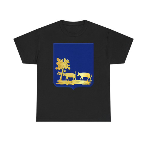
Oostzaan Wapen 1816 (Netherlands) T-Shirt Design
A Heraldic Statement
This t-shirt showcases the official coat of arms (wapen) of Oostzaan, a design officially confirmed in 1816. The artwork centers around a classic heraldic composition, steeped in symbolism and history.
The Central Emblem
At the heart of the design lies a striking red ox's head, the most prominent element. The ox head is a canting element, a visual pun directly referencing the name "Oostzaan," which is derived from the word "os," meaning "ox" in Dutch. The ox's head faces forward, asserting a sense of strength and local identity.
In the ox's mouth is a sprig of a green branch, bearing three leaves. This detail adds a contrasting element of life and nature against the boldness of the ox's head. The green branch may represent growth, fertility, and allude to the agricultural or rural essence of Oostzaan.
Color Palette and Background
The design utilizes a crisp color scheme. The primary field of the shield is a pure silver (rendered as white) backdrop, which establishes a feeling of elegance and purity. The red ox head provides visual contrast, commanding attention. The green branch provides the perfect accent of nature and balance.
Municipal Crown
To further represent the municipality, the design features a golden mural crown with three towers above the shield. This crown signifies Oostzaan’s status as a local governing body, connecting the design to the town’s civic identity.