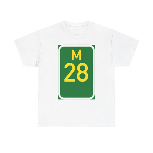
- SKU
- 692cf817eeefa5c3bc0cd19b
- Condition
- New
- Material
- Solid colors: 100% cotton. Heather/Tweed/Russet: 50% cotton, 50% polyester. Sport Grey/Antique: 90% cotton, 10% polyester.
- Production
- Printed using Direct-to-Garment (DTG) technology for vibrant, lasting designs.
- Origin
- Printed in the USA on imported garments (Nicaragua).
- Shipping
- FREE Shipping to the USA. Orders ship in 2–3 business days. 30-Day hassle-free returns. International Shipping is calculated at Checkout.
A reliable classic cotton tee built for comfort, durability, and style. The specially spun fibers provide a smooth surface for premium printing. No side seams mean there are no itchy interruptions under the arms.
- 100% heavy cotton (5.3 oz/yd²)
- Smooth surface for vivid, long-lasting prints
- No side seams for irritation-free wear
- Reinforced shoulders to maintain shape
- Classic unisex fit
- Tear-away label for scratch-free wear
A soft, cozy hooded sweatshirt built for comfort-first living. Made from a thick cotton/polyester blend, it feels plush, soft and warm — perfect for chilly mornings, late-night walks, or working from the couch.
- 50% cotton, 50% polyester (8.0 oz/yd²)
- Brushed interior for a cozy hand-feel
- Large kangaroo pocket for warmth and storage
- Matching drawstring for a clean, coordinated look
- Durable construction designed to hold shape and color
A clean, dependable crewneck engineered for everyday wear. The cotton/poly blend keeps prints bright and the fit approachable — neither too boxy nor too snug.
- 50% cotton, 50% polyester (8.0 oz/yd²)
- Ribbed knit collar to prevent stretching
- No side seams for a cleaner feel
- Midweight construction — warm without bulk
- Holds print detail and color after repeated washing
Measurements in inches — compare with a tee you already own laid flat.
| Size | Width | Length | Sleeve |
|---|
| S | 18.00 | 28.00 | 15.10 |
| M | 20.00 | 29.00 | 16.50 |
| L | 22.00 | 30.00 | 18.00 |
| XL | 24.00 | 31.00 | 19.50 |
| 2XL | 26.00 | 32.00 | 21.00 |
| 3XL | 28.00 | 33.00 | 22.40 |
| 4XL | 30.00 | 34.00 | 23.70 |
| 5XL | 32.00 | 35.00 | 25.00 |
Measurements in inches — compare with a hoodie you already own laid flat.
| Size | Width | Length | Sleeve |
|---|
| S | 20.08 | 27.17 | 33.50 |
| M | 22.05 | 27.95 | 34.50 |
| L | 24.02 | 29.13 | 35.50 |
| XL | 25.98 | 29.92 | 36.50 |
| 2XL | 27.99 | 31.10 | 37.50 |
| 3XL | 29.92 | 31.89 | 38.50 |
| 4XL | 31.89 | 33.07 | 39.50 |
| 5XL | 33.86 | 33.86 | 40.50 |
Measurements in inches — compare with a sweatshirt you already own laid flat.
| Size | Width | Length | Sleeve |
|---|
| S | 20.00 | 27.00 | 33.50 |
| M | 22.01 | 28.00 | 34.50 |
| L | 24.00 | 29.00 | 35.50 |
| XL | 26.00 | 30.00 | 36.50 |
| 2XL | 28.00 | 31.00 | 37.50 |
| 3XL | 30.00 | 32.00 | 38.50 |
| 4XL | 32.00 | 33.00 | 39.50 |
| 5XL | 34.00 | 34.00 | 40.50 |