


 Heraldry
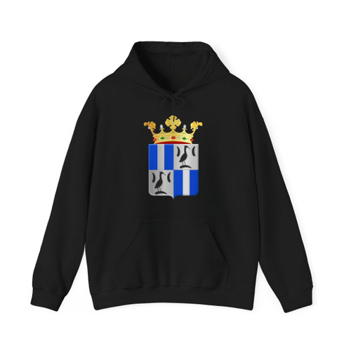
Weesperkarspel wapen 1817 (Netherlands) (Coat of Arms)
from $27.99
Hoodie

Heraldry
Weesperkarspel wapen 1817 (Netherlands) (Coat of Arms)
Garment
T-Shirt
from $19.99
Ships within 3–7 business days. Free shipping to U.S. addresses.
Bulk offer: any 3 items 10% off, 5 items 20%, 10 items 30%. Applied automatically in the cart.
- Free shipping on all U.S. orders. Flat-rate international shipping: $19.99 USD.
- Made to order. Orders are processed and shipped within 3–7 business days.
- Damaged or misprinted? Free replacement. Report it within 30 days of delivery. Refund & return policy
- Material
- Solid colors: 100% cotton. Heather/Tweed/Russet: 50% cotton, 50% polyester. Sport Grey/Antique: 90% cotton, 10% polyester.
- Production
- Printed using Direct-to-Garment (DTG) technology for vibrant, lasting designs.
- Origin
- Printed in the USA on imported garments (Nicaragua).
About this design
Weesperkarspel Wapen 1817 T-Shirt: Design Overview
A Heraldic Statement
This t-shirt showcases the historic coat of arms of Weesperkarspel, a former municipality in North Holland, Netherlands, as it was granted in 1817. The design is a bold representation of heraldic tradition, conveying a sense of history and civic pride.
The Emblematic Design
The artwork presents the coat of arms in its classical form: a shield featuring a striking contrast. The field of the shield is rendered in a vibrant azure blue, providing a clear and visually appealing backdrop.
Dominating the center of the shield is a single, broad vertical stripe, or "pale," executed in solid black (sable). This simple yet powerful graphic element creates a strong visual impact.
Meaning and Symbolism
The coat of arms, by its very nature, is a symbol. While the specific symbolism of the Weesperkarspel arms isn't explicitly documented in the provided information, the design's inherent clarity and adherence to heraldic principles speak volumes. The bold contrast of blue and black creates a focal point, drawing the eye and emphasizing the unique identity of the historical municipality.
This design is a timeless emblem of Weesperkarspel's past, presented with the clean lines and elegant simplicity characteristic of early 19th-century heraldry.
Same design, other garments
More like this
-
Heraldry
Weesperkarspel wapen 1817 (Netherlands) (Coat of Arms)
from $27.99
Hoodie
-
 Heraldry
Weesperkarspel wapen 1949 (Netherlands) (Coat of Arms)
from $19.99
T-Shirt
-
 Heraldry
Opmeer wapen 1817 (Netherlands) (Coat of Arms)
from $19.99
T-Shirt
-
 Heraldry
Wijdewormer wapen 1817 (Netherlands) (Coat of Arms)
from $19.99
T-Shirt
-
 Heraldry
Weesperkarspel wapen 1949 (Netherlands) (Coat of Arms)
from $27.99
Hoodie